Category: Restoration

  • All About Nib Smoothing

    A scratchy nib is one of the most common issues with a fountain pen. Probably 70% of our repairs include some kind of nib repair. As a result, the topic is one of the most enduring in the pen community, both in real life and online.

    As with so many popular subjects, opinions abound, and thus questions. Having repaired thousands of pens over the last twelve years, I thought I would publish this list of nib smoothing “frequently asked questions”.


    Why is my pen scratchy?

    Don't try this at home-or anywhere else!
    Don’t try this at home-or anywhere else!

    The simple answer is: damage. The tines of a nib, and the tipping on the end, must remain carefully aligned. This allows for proper ink flow, and smooth writing. Nibs made of gold can be bent–some quite easily–out of alignment. Normal use shouldn’t be a problem, but there will be a problem if you: drop your pen; try to flex it too hard; insert anything foreign (like a thin knife, perhaps to clean it out).

    One defect that causes scratchiness is when one of the tines is (even slightly) twisted in relation to the other. Unless the tines are properly parallel first, nothing else will make it a smooth writer. We have seen tipping material sanded away to nothing, because the person working on it didn’t realize the tines were misaligned. How can you tell if this is the problem? Unless you have a good source of magnification, you will have a difficult time knowing. A loupe or magnifier with a power of at least 15-20x is needed to tell for certain. And even then it takes a practiced eye.

    Are some pens more prone to scratchiness than others?

    The more history a pen has, the more likely it is to be damaged in this way; a vintage pen found in an antique shop will probably need some nib work! Also, any nib with gold content over 14k (58.5% gold content) will be more prone to damage.*

    What is the best way to smooth my scratchy nib?

    Honestly, take it to a professional. Nib smoothing is one of the most challenging aspects of pen repair. It is easy to make the problem worse. And, because there is a limited amount of tipping on each pen, you could actually destroy the nib.

    But I really, really want to smooth my own nibs! Do you have any suggestions?

    I do, but proceed at your own risk!

    1. Start with pens you don’t care about. You will destroy the first few.
    2. Richard Binder has kindly and generously provided the notes from his nib smoothing workshop. They are excellent, and include detailed instructions for general nib smoothing. Read them thoroughly before you begin. If you do, you will destroy one less pen when practicing.

    Where can I get nib smoothing tools?

    You don’t need many tools. Here is what I use (with the caveat that this is a steep learning curve, and you embark on it at your own risk). I have no affiliation with any of the links below, and this content is not sponsored.

    • 3M Micro-mesh sanding pads, with foam backing. I use three grits: 12000, 6000, and 3600.
    • Strips of wet/dry sandpaper. I use 1000 grit. This is for smoothing sharp interior corners of the tipping material.
    • Brass foil, for cleaning out the slit. I often use the 0.0015″ thickness. The variety pack (listed at the link) will keep you going for a long time.
    • A magnifier. What you get depends on your needs and preferences. Try to get something hands-free, like a visor. Don’t ask what I use, because it probably cost more than your car. ; )
    • Mini-pliers. Only use pliers with smooth jaws, and use some of your new sandpaper to smooth the sharp edges. The best are small modelling pliers used by the mini-fig crowd (think Warhammer). You get what you pay for (a good brand is GodHand, from Japan).
    • Good lighting. If you have a ring light for zoom that would work well.

    Are there any secret tips that no one talks about?

    It mostly has to do with experience and motor-muscle memory, which can’t really be talked about. However, I have a few pieces of advice.

    First, if you have struggled for what seems like hours, and the nib is still scratchy no matter what you do, the tipping is twisted. I find this happens about half the time. This is an advanced job, not for beginners: send it away.
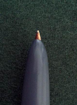
    Parker "51" nib detail
    A Parker "51" can’t be worked on like this!

    Second, a warning about hooded pens, like Parker 51s. Most nibs can be worked on while still in place on the pen. Hooded pens are the exception. If you try to work on one of these with the hood on, you will almost certainly damage the hood.

    Third, super fine and flexy nibs are advanced. You need the experience of working on firm, broader nibs before tackling the subtleties of a nib that moves around while you write. And small tipping means less chance for failure, and the need for greater magnification.


    In summary, nib smoothing is a challenging, but important pen repair skill. Much of that skill is learned the hard way, by practicing and absorbing collateral damage (i.e.: dead pens). But with persistence and hard work you can learn how, and never have to endure a scratchy pen again!


    *To be fair, it’s more complicated than this. Gold alloys can be hardened, both in manufacture, and over time through use. But the more gold in the mix, the less hard the alloy will be. A 22k gold nib will never harden enough to be flexy, no matter what the manufacturer claims. You can’t pay enough to change the laws of physics! [Go back]

  • Hey, Where Is Your Contact Info?

    Many people in the pen community, and in society in general, like to make a direct connection with each other. They want to personally get to know others with their interests. And this is especially true if they are considering sending off their valuable and sentimental pens!

    Some time ago, we made the choice to remove our personal contact information from this site. In connection with this, we made arrangements with two excellent pen shops to act as our agents in accepting repairs. It has come to my attention that this choice is confusing to some people, so I thought it might be good to clarify our decisions. There are two main factors at play: one personal, and one which is strictly business.

    Business Is Business

    First, down to business. Time is money, and none of us have much time. Like the majority of pen repairers, I have to do things other than pen repair in order to pay my bills. I have another full-time job, and several disabled dependents. When interacting with repair clients, time slips away quickly. If I write emails to each customer, or meet them in person to pick up or drop off repairs, it can easily add an hour or two on to a repair which is billed as a half-hour job.

    I then have to make a choice: do I triple, or quadruple, my fees to make up for that time spent with a client? Or do I simply consider that time part of doing business, which is essentially taking a 75% pay cut? This is, obviously, a difficult choice. However, there is another, personal, factor in play.

    Disability Is Business, Too

    I am autistic: I have what used to be called Asperger’s Syndrome. I can’t simply chat with people like so many can. It is like living in a foreign language you barely know; everything has to be translated and figured out as you go, and you feel exhausted afterwards. Usually you say the wrong thing, and people get upset. This includes not only face-to-face conversations, but also email, phone calls, and things like Facebook and forums.

    And so, if I publish my email, answer my phone, hang around online forums, and meet with folks in person, I will not be able to save pens. I won’t have enough time, and I won’t have enough energy. There are lots of people who love to chat, and be friends, and enthuse about pens. But there are very few who can look at a pen and know immediately how it is put together, how to take it apart, and why it is not doing what it should; how to make the part it needs; the structure of the components, and what stresses they can withstand.

    I have made the choice to spend time doing what I do well: pen repair. I rely on Peter Laywine and Russell Hemsworth, and their amazing teams, to do the talking for me. Unlike me, they are excellent communicators. Our arrangements are not perfect, because we are all people. But it means your questions get answered, and I get to spend my time saving pens. Your pens.

    There may come a time when my life’s balances will change, and that might enable me to open up some forms of direct contact. But for now, thanks for your support and understanding.

  • Book Review: Estonian Knitting 2: Socks & Stockings

    • Anu Pink
    • Estonian Knitting 2: Socks & Stockings
    • Saara Publishing House (2018, Türi, Estonia)
    • 36.80€; isbn: 978-9949-7268-2-0
    • 384 pages, illustrations, photos, diagrams; hardcover.

    With the huge popularity of knitting, hundreds of books are published on the subject each year. Many of them are similar, and our eyes begin to glaze over just looking at them all. But the “Estonian Knitting” series is different. Beyond different; like the difference between an earthworm and the moon.

    Equal parts history and technical manual, these volumes–the latest of which focuses on socks and stockings–are comprehensive and beautiful. The book is specific and limited, obviously, to knitting in Estonia. But Estonian knitting, presented here in its purest form, is a world heritage craft.

    Beginning with an historical overview, Anu Pink’s qualifications as an academic are undeniable. Dozens of historical photos; accession notation excerpts specific to each illustration; original photos of artifacts: each and every one with an institution designation and accession number. No statement is unqualified, no illustration meaningless or omitted. Yet the style is easy to read, and each photo a treasure. Originally published in Estonian, the English translation is excellent, showing a mastery of both languages by Sepp and Allen.

    While full of historical details, the book is also an advanced technical manual. Nearly every photo has an accompanying pattern chart, and detailed construction notes. An extensive section on techniques includes full details on some twelve (!) heel methods, and multiple toe finishes. Of the nearly 400 pages, approximately two thirds are sock patterns, neatly categorized by style and geographical location within Estonia.

    One word of warning: this is not a beginner’s book of patterns. You won’t be held by the hand and told how many stiches to cast on, or how many rows to knit. But if you have been knitting socks for awhile, and are a fan of Patricia Gibson-Roberts or Anna Zilboorg’s approaches, this book will fit right in to your library.

    And finally, as someone with experience in both printing and bookbinding, a note on the book itself: this is not a book that will fall apart. Each gathering is sewn properly, the glue is robust, and the paper & printing is of excellent quality. The text block is a whopping 11.5 inches (29 cm) tall, and an inch (2.5 cm) thick, but shows no tendency to bow or pull at the gutters (where it attaches to the covers). No expense was spared in its production, and you can tell.

    This series can be hard to find, as is often the case with specialty titles. We ordered ours directly from the publisher, and including shipping it came to about $100 (Canadian). It arrived within two weeks, packaged well enough to withstand a small war.

    Estonian Knitting: Socks & Stockings is a rarity among books: an history, a technical manual, an arts & culture inspiration. The series amazes you, leaves you gasping for more, and then delivers another installment, right on time. We can’t wait for the next volume: mittens & gloves.

  • Solved: Who Made the Pens of Birks Jewellers?

    Birks Breakdown

    Like most Canadian jewellers at the turn of the twentieth century, Henry Birks & Sons, of Montréal, sold pens. While they don’t often turn up today, occasionally we have one cross our repair bench. While a Birks pen is usually not of the highest quality, they are good, solid pens, usually with the nice flexible nib that was usual for that era.

    One thing which has consistently stumped collectors is the question: just who made the Birks pens? Like most jewellers and department stores, they out-sourced the actual manufacture, having their own imprint put on pens made by one or another of the major manufacturers. And, what with the sheer number of pen makers at that time, there was a great deal of choice as to quality and cost. Happily for us, one such pen we recently restored has definitive evidence of its maker, and has a few other great features worth looking at.

    an early aerometric-filler

    Parker 51 aerometric

    While later pens, like the Parker “51”, are often assumed to be the originators of the ‘aerometric’ filling system, the design is actually much earlier. The obvious way to fill a rubber sac with ink is to squish it flat, then let it return to it’s natural shape with the open end submerged in ink. Various makers tried various means to do this, but one of the most robust and simple is what Parker called the ‘aerometric’ system.

    The barrel is removed from the pen, revealing the sac, covered by a protective housing. A thumb-sized hole in the side of the housing reveals a pressure bar, which ensures that the entire sac is deflated. The housing prevents the user from accidentally squishing the full sac of ink (which is pretty easy to do, making an horrid mess!)

    Birks Pressure Bar

    This Birks pen is a very early version of that system, almost identical in engineering to Parker‘s 1949 version. The barrel pulls off, revealing a ribbed nickel-plated housing, with hole and pressure bar covering the sac. The pressure bar alignment is maintained using a slot-and-key design not dis-similar to Wahl’s slightly later pressure bars.

    but who made it?

    The key to identifying the maker is on, and in, the cap. It caught our attention right away, as it had an interior rattle, which is quite unusual in a cap, and not usually a good sign. When we looked up inside, something was loose, but it didn’t seem to be broken. Upon close inspection, we found the answer to the puzzle.

    Birks Patent Imprint

    While it was rare to have a third-party manufacturer put their own imprint on a pen, they had no compunctions about protecting their design rights. In that spirit, this maker stamped the patent number—now quite worn away— on the cap: U.S. Pat. 969198

    Sanford Cap Patent

    This particular patent was for a self-sealing cap, addressing once more the ages-old problem of pens leaking into their caps. But the interesting thing is the patent’s filer: none other than William Sanford, of Sanford & Bennet, whose name later became better known in connection with ink. (As a side-note, the name is still connected with pens, currently being part of the Newell-Rubbermaid empire.)

    With this information, things quickly fall into place. Sanford filed other patents, including one for the very ‘aerometric’ filling system also used in this pen (U.S. Pat. 807500).

    Sanford Filler Patent

    why do they do the things they do?

    Of course, answering such questions leads to others. Why did they list the cap patent, but not that of the filling system? Did Sanford & Bennet supply all Birks pens? Why didn’t one of the most popular filling systems of 1949 take off four decades earlier, when it was first introduced?

    Until we see more of these pens, many of these questions will remain unanswered in a definitive way. But one thing we can say with certainty: Sanford manufactured pens for the Canadian market in the early 1900s, for Henry Birks & Sons, fine jewellers of Montréal.

  • Free Victorian Pen Catalogue Online

    Information is gold; sometimes more than figuratively.

    We came across a lovely Victorian pen catalogue in our favourite collection, archive.org. Titled, in fine Victorian fashion, History of the invention and illustrated process of making Foley’s diamond pointed gold pens with complete illustrated catalogue[…]

    The first half of the book is an excellent catalogue of Foley’s products: dip pens & holders, propelling pencils, toothpick & ear spoon combos (yes, really), and other treasures. There is some lovely information to be parsed from these pages. For example, did you know that some pen holders were designed to have the tail end pulled off, so that the two pieces would fit into a leather fitted box? Or that propelling pencils were originally referred to as “pencil cases”?

    Foleys nib brazing

    But what really shines for us is the second half of the book (about 40 pages), where Foley happily explains each step in the manufacture of gold nibs. With seventeen illustrations of workers at their benches, with their tools! (To be fair, one is of accountants and the boss. But close enough.)

    Being a product of the Victorian age, rhetoric abounds; being a product of America, there is plenty of flag-waving British denegration. And taking place at the birth of real salesmanship, there are a few gems, such as the apparently well-known ‘fact’ that users of steel pens (as opposed to gold pens) lose the use of their writing hands due to errant electrical currents! Nonetheless, this book is still an important resource for us today.

    Most of the tools used at that time are quite simple, and can be had very affordably by us. Many 19th century nibs were used for decades, and are still very sound today. The methods used in manufacturing those high-quality products are proven here to be quite simple, which belies the voodoo-like claims of many modern manufacturers.

    In fact, our conviction—after reading Foley—is even stronger: newly-manufactured pens have only a shadow of the quality they once had. Sub-standard modern materials, bad design, and shoddy workmanship plague even the highest-priced pens.

    Reading these descriptions, and seeing those tools, is an empowering thing. There is no reason why anyone with a quick mind and stable hand cannot accomplish even the most demanding of manufacture, or repairs. Pens and pencils weren’t born, they were made. They can be un-made, and they can be re-made. And, most of all, they can be appreciated.


    Foleys Title

    A complete copy of Foley can be found at https://archive.org/details/historyofinventi00fole. It is a large file, best reviewed on a more powerful computer. Despite the fact that some enterprising people sell it, it is in the public domain; this copy came from the US Library of Congress. You can legally download it, copy it, distribute it, and irritate profiteers with it.

  • What We Can Learn From a Copper Pearl Frankenpen

    What We Can Learn From a Copper Pearl Frankenpen

    We came across an interesting pen the other day, “in the wild”, which is to say in an antiques mall. Not exactly a beautiful pen: not in great condition, nor very valuable, in terms of dollar value. But a pen which is important for a couple of reasons.

    Some Background: the Parkette Deluxe

    Parkette 1934 Catalog

    The Parker “Parkette Deluxe” was originally issued in 1933. After the profitable heyday of the 1920s, many pen manufacturers had to make serious concessions to the new economic realities of the depression. Parker, always fairly nimble, issued several models at a much lower price point than the Duofold, and the Parkette was one of these.

    The Duofold was steadfastly a button-fill fountain pen, and the now-famous Vacumatic was still in development. So, perhaps as a way of differentiating the line, the decision was made to issue a lever-fill pen—the first time Parker did so. The Parkette Deluxe was additionally distinct in initially having full-length fluting along both the barrel and cap. They were issued in celluloid, in four main colours: red, green, grey, & black.

    Blame Canada

    It has been said that, when it comes to Parker, the only rule is that there are no rules. But when it comes to Canadian production, it sometimes seems as though the only rule was that all rules should be deliberately broken. Additionally, there is very little available in the way of contemporary documentation. As a result, the journey through Canadian pen variants can be a bit wild.

    So, when Parker developed the lower-end depression-era pens, Parker Canada decided to issue an extra, undocumented, colour: what some have suitably dubbed “Copper Pearl”.

    There are a few questions about this colour: Was it actually a colour proper, or just a discolouration of an existing, canonical colour? How long was it used? For what models was it used? The answers are often just guesswork.

    Some Copper Pearl Evidence

    Copper Pearl Parkette Deluxe

    Knowing these things, when we catch a glimpse of “Copper Pearl”, our interest perks up. And this one definitely caught our attention, for more than one reason.

    The colour is one obvious reason. “Copper Pearl” without a doubt. But something was just not right; something an expert would see in a moment, but that would not necessarily be obvious to everyone. The barrel is fluted, and has the Parkette Deluxe imprint. However, the cap is just wrong. No fluting, fitting slightly too tight, and a totally incorrect clip configuration: it’s a Parkette Deluxe body with a Challenger cap stitched to it. A genuine ‘frankenpen’, but what a treasure-trove of information!

    Parkette Deluxe Body

    Challenger Cap Detail

    In one cobbled-together pen is evidence that, rather than being a mistake, a trial, or a discolouration, “Copper Pearl” was a genuine production colour out of Parker’s Toronto plant. This pen (or, more accurately: these pen parts) show that “Copper Pearl” was used in two models from the 1930s: the second form of the Parkette Deluxe (1934) and the Challenger (this cap is the earliest version, from 1934).

    Of course, the more evidence there is, the bigger the resulting picture. And we do have a bit more.

    Pencils Are Invited To This Party

    Parkette Deluxe Pencil

    Our introduction to “Copper Pearl” was not, actually a pen, but a pencil. Again, it was the unusual colour which caught our attention. We only learned later just how unusual the colour is.

    When combined with the Parkette Deluxe body and Challenger cap, this pencil gives us a slightly wider view of the extent of the use of “Copper Pearl”. This pencil is the earliest version of the Parkette, with a band of white plastic at the finial, rather than gold-filled brass. This means that the use of this colour lasted through two versions of the model, lasting possibly throughout that production year. Far from a mistake, or sun damage!

    A Final Detail

    Parkette Deluxe Nib Detail

    As a final note of esoteric interest, the nib on the Parkette Deluxe also breaks a few rules.

    The nibs on these pens were issued with partial platinum plating, similar to Sheaffer’s two-toned nibs. Except in Canada, because we can.

    A Lesson For Us All

    It can be easy to diminish the value of pens which are incomplete, worn, or cobbled together from parts. And pencils, sad to say, often get ignored completely. But measuring the worth of artifacts like these—and they are, indeed, artifacts—by their collectible-market value alone is a mistake.

    Likewise, it can be easy to assume that we—as an individual or a community—know all there is to know about any given aspect of pens and their manufacture. This, too, is a mistake.

    Even eighty years after their manufacture, new understandings of pens, their manufacture, and marketing, are coming to light. Some speculations are put to rest, and others arise. Sometimes this can be a result of a lauded pen consigned by an important collector. But other times, it can come from a chance encounter with a quick-and-dirty repair job, of a pen in dubious condition, in an antique mall pen-pile.

    The important thing is to keep looking, and then to keep thinking about what we see. And never to assume that everything is known.

    Parker Copper Pearl Group